Cinema India: The Art of Bollywood
Indian Film Hoarding
March 2002 (made)
March 2002 (made)
| Artist/Maker | |
| Place of origin |
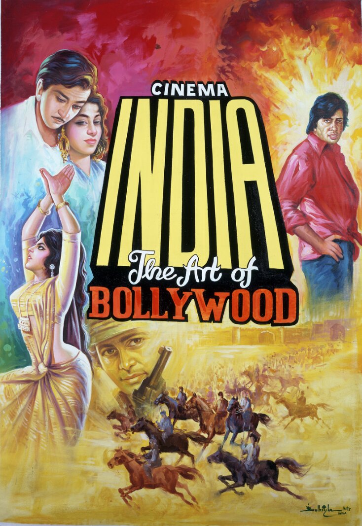
The design of this hoarding is centred around the title of the exhibition. Positioned around the title are various stars and scenes from the Indian cinema. In the top right hand corner is a classic image of Amitabh Bachchan, in the top left hand corner are Raj Kapoor and Nargis and in the bottom left hand side is an image of a dancer. Along the bottom is a scene of men riding horses. The title is in bold lettering outlined in yellow. The artists signature is in the bottom right hand corner.
Object details
| Object type | |
| Title | Cinema India: The Art of Bollywood |
| Materials and techniques | Oil paint on canvas |
| Brief description | Original design for the poster for the 'Cinema India: The Art of Bollywood' Exhibition held at the V&A, 25 June to 6 October 2002. Oil paint on canvas, by Balkrishna Arts, March 2002, Mumbai, India |
| Physical description | The design of this hoarding is centred around the title of the exhibition. Positioned around the title are various stars and scenes from the Indian cinema. In the top right hand corner is a classic image of Amitabh Bachchan, in the top left hand corner are Raj Kapoor and Nargis and in the bottom left hand side is an image of a dancer. Along the bottom is a scene of men riding horses. The title is in bold lettering outlined in yellow. The artists signature is in the bottom right hand corner. |
| Object history | This hoarding was commissioned as part of the Cinema India exhibition at the V&A. The aim was to produce all the marketing posters and leaflets for this exhibition from this one hoarding. The design group, Graphic Thought Facility were employed by the V&A to work on this project. They were responsible for creating the graphic design identity for the contemporary space in which this exhibition was displayed. The design process was as follows: Balkrishn Arts, the group of hoarding painters in Bombay were sent colour photocopies of classic film posters from our collection. They were given a brief written outline and a very rough diagram of the final image the museum was looking for. Sketches were sent back and forth by fax and the final image was painted on canvas and sent to the museum. It was felt by Graphic Thought Facility and the V&A Marketing Department that the typographic on the original painting was not suitable for reproduction on the actual posters to be used for marketing the exhibition. Using computer aided design/ photography and photoshop the original title was brushed out and new typography added. The mass produced poster used for marketing purposes had the Contemporary space identity and V&A logo added. Details from the original painting were used for the exhibition leaflet and the Press/Private view invitations. |
| Collection | |
| Accession number | IS.115-2002 |
About this object record
Explore the Collections contains over a million catalogue records, and over half a million images. It is a working database that includes information compiled over the life of the museum. Some of our records may contain offensive and discriminatory language, or reflect outdated ideas, practice and analysis. We are committed to addressing these issues, and to review and update our records accordingly.
You can write to us to suggest improvements to the record.
Suggest feedback
You can write to us to suggest improvements to the record.
Suggest feedback
| Record created | March 11, 2003 |
| Record URL |
Download as: JSON
