Design for Dyslexie Font
Notebook
early 21st century (made)
early 21st century (made)
| Artist/Maker | |
| Place of origin |
The Dyslexie font was created by graphic designer Christian Boer (b. 1981) who himself has dyslexia and created the font in order to improve his own reading. Boer graduated from the Utrecht Art Academy in 2008 and developed the typeface as his final thesis project.
Boer identified that complex fonts are more difficult for dyslexic people to recognise and so Dyslexie needed to be a simple font, with each letter having unique visual traits. For example, the letters 'u' and 'n' would need to be significantly different in form, to allow for them to be distinguishable even if they were reversed or flipped – a common problem encountered by Dyslexic readers.
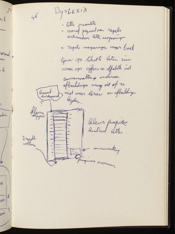
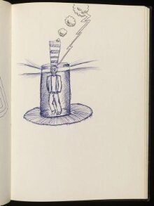
This notebook contains early sketches and research for Dyslexie, including Boer's initial rules for creating the Dyslexie Font. These rules identify particular guidelines, including the unique form of every letter and the use of weighting or thickening of certain parts of each letter, to allow for greater ease of reading.
Object details
| Categories | |
| Object type | |
| Title | Design for Dyslexie Font (generic title) |
| Materials and techniques | Notebook with carboard and fabric cover with bound (perfect binding) pages inside, pages drawn and written on with ink and pencil. |
| Brief description | Christian Boer; notebook including inital designs for Dyslexie Font, early 21st century |
| Physical description | Black notebook including pages on the design of the Dyslexie Font. |
| Dimensions |
|
| Style | |
| Production type | Design |
| Credit line | Given by Christian Boer |
| Object history | The Dyslexie font was created by graphic designer Christian Boer (b.1981) who has dyslexia and created the font to improve his own reading. Boer graduated from the Utrecht Art Academy in 2008 and developed the typeface as his final thesis project. In 2008, Boer first considered the idea of a coloured letter layout to enable people with dyslexia to read more easily, and learnt about rotating, reversing letters and word skipping (all of which are common problems whilst reading for people with dyslexia). As a result of this research, he came to the conclusion that people with dyslexia have problems recognising letter forms and objects in 2D that do not occur if they are represented as 3D objects. Starting with this premise, all letters are approached as 3D objects and then transformed to 2D letters. This makes every letter totally unique which avoids confusion between letters. Another feature is that the capital letters are bolder, in order to help the reader to identity the beginning of each sentence. The font’s primary concern is to maximise efficiency in reading comprehension rather than to create letter forms that are aesthetically pleasing. Boer began selling the typeface in 2009 and clients now include Pixar, Nintendo, Shell, and Google who offer the font to employees. The regular version of the font remains free to individual users. Boer has won awards for his work on the typeface including the Smart Future Minds Aware 2011 in Amsterdam and nominations for the Fast Company Innovation by Design Awards 2012 and INDEX Design to Improve Life awards (2013) of Copenhagen. |
| Summary | The Dyslexie font was created by graphic designer Christian Boer (b. 1981) who himself has dyslexia and created the font in order to improve his own reading. Boer graduated from the Utrecht Art Academy in 2008 and developed the typeface as his final thesis project. Boer identified that complex fonts are more difficult for dyslexic people to recognise and so Dyslexie needed to be a simple font, with each letter having unique visual traits. For example, the letters 'u' and 'n' would need to be significantly different in form, to allow for them to be distinguishable even if they were reversed or flipped – a common problem encountered by Dyslexic readers. This notebook contains early sketches and research for Dyslexie, including Boer's initial rules for creating the Dyslexie Font. These rules identify particular guidelines, including the unique form of every letter and the use of weighting or thickening of certain parts of each letter, to allow for greater ease of reading. |
| Collection | |
| Accession number | E.757-2017 |
About this object record
Explore the Collections contains over a million catalogue records, and over half a million images. It is a working database that includes information compiled over the life of the museum. Some of our records may contain offensive and discriminatory language, or reflect outdated ideas, practice and analysis. We are committed to addressing these issues, and to review and update our records accordingly.
You can write to us to suggest improvements to the record.
Suggest feedback
You can write to us to suggest improvements to the record.
Suggest feedback
| Record created | November 28, 2017 |
| Record URL |
Download as: JSON


