
London's Kerning
Print
2006 (made)
2006 (made)
| Artist/Maker | |
| Place of origin |
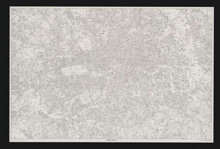
This poster was commissioned by The International Society of Typographers for the exhibition My London, My City at the 2006 London Design Festival. In typography kerning or mortising is the process of adjusting letter spacing in a proportional font so that the blank spaces between each pair of letters all have a similar area.
Delve deeper
Discover more about this object

Object details
| Categories | |
| Object type | |
| Title | London's Kerning (assigned by artist) |
| Materials and techniques | Lithograph on paper |
| Brief description | "London's Kerning", by NB: Studio, lithograph; United Kingdom, 2006 |
| Physical description | Map of London consisting of street names with no lines. |
| Dimensions |
|
| Production type | Limited edition |
| Marks and inscriptions |
|
| Gallery label | This poster was commissioned by The International Society of Typographers for the exhibition My London, My City at the 2006 London Design Festival. In typography kerning or mortising is the process of adjusting letter spacing in a proportional font so that the blank spaces between each pair of letters all have a similar area.(2007) |
| Credit line | Given by NB: Studio |
| Historical context | Designed for the ISTD exhibition My London/My City |
| Production | Attribution note: edition of 100 |
| Place depicted | |
| Summary | This poster was commissioned by The International Society of Typographers for the exhibition My London, My City at the 2006 London Design Festival. In typography kerning or mortising is the process of adjusting letter spacing in a proportional font so that the blank spaces between each pair of letters all have a similar area. |
| Collection | |
| Accession number | E.3127-2007 |
About this object record
Explore the Collections contains over a million catalogue records, and over half a million images. It is a working database that includes information compiled over the life of the museum. Some of our records may contain offensive and discriminatory language, or reflect outdated ideas, practice and analysis. We are committed to addressing these issues, and to review and update our records accordingly.
You can write to us to suggest improvements to the record.
Suggest feedback
You can write to us to suggest improvements to the record.
Suggest feedback
| Record created | October 23, 2007 |
| Record URL |
Download as: JSON
