| Categories | |
| Object type | |
| Title | How gas is made
(published title) |
| Materials and techniques | Single fold printed sheet secured into card cover with two wire stitches through centre fold of spine. Cover has fold out from back.. |
| Brief description | Trade catalogue, How gas is made, Gas Light and Coke Company, London, 1930s. |
| Physical description | How Gas is Made
Gas Light and Coke Company.
Publisher:
London Gas Light and Coke Company 193?
Description:
4 unnumbered pages 189 mm
Notes:
Title from cover
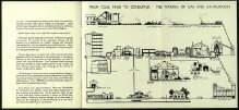
Includes fold out diagram#; 'From coal mine to customer. The making of gas and by-products'
|
| Dimensions | - Length: 190mm
(closed)
(Note: Measured by Book Conservation in measuring box)
- Width: 142mm
(closed)
(Note: Measured by Book Conservation in measuring box)
- Depth: 1.5mm
(closed)
(Note: Measured by Book Conservation in measuring box)
|
| Style | |
| Production type | Mass produced |
| Gallery label | - (2018)
- How gas is made
London, 1930s
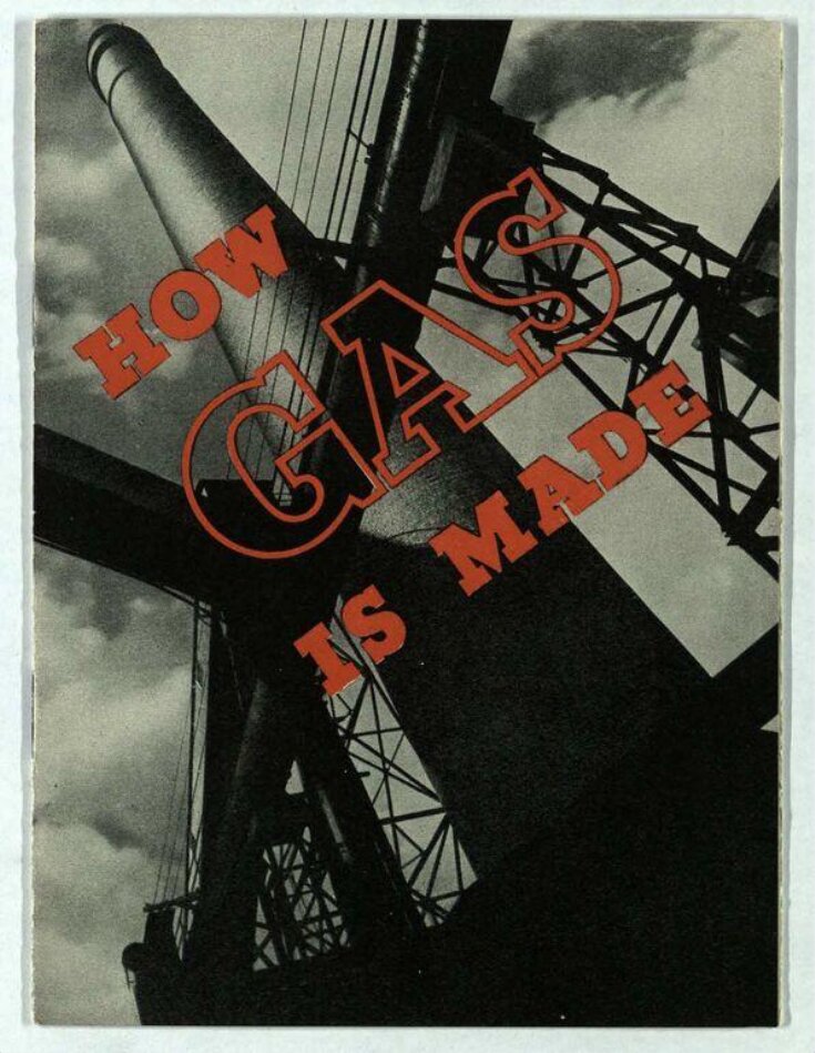
With the expansion of electricity, gas companies made efforts to maintain their dominance of the energy market. ‘How gas is made’ explains the process. The bold cover conveys a message of dynamic energy through the dramatic use of diagonals in the photograph and the typography, and the contrast between the black-and-white image and the bright red text.
Halftone and lithography
Issued by the Gas, Light and Coke Company
Museum no. 38041800576381 - From 'The New Line', De La Warr Pavilion, 2016-17
How Gas is made, mid 1930s
Designer unknown
On loan from the Victoria and Albert Museum - From 'The New Line', De La Warr Pavilion, 2016-17
This exhibition of commercial print from the 1930s includes material designed by Serge Chermayeff, Edward McKnight Kauffer, Paul Nash, Eric Ravilious, Graham Sutherland and László Moholy-Nagy, alongside films by Len Lye commissioned by the General Post Office Film Unit and Churchman Cigarettes.
Europe in the 1930s underwent enormous social, political, cultural and technological change. To capture some of these changes through contemporary commercial print, Philip James at the National Art Library at the Victoria and Albert Museum developed the ‘Jobbing Printing Collection’. He requested samples of work from high-profile companies, artists and designers in Europe and North America, including items designed by members of the Bauhaus school, made for shops such as Fortnum & Mason, and for companies such as Elizabeth Arden, Shell and Imperial Airways.
The New Line presents a selection of items from the NAL’s collection, including lifestyle and trade magazines, beauty catalogues, tourism brochures and a sample chart for stockings. It highlights how the movement of people across borders, often escaping oppressive political regimes, led to the exchange of ideas and aesthetics, and the formation of new expressions of modernity. It also shows how interconnected art, design and industry were throughout the 1930s.
Alongside material from the V&A National Art Library’s Jobbing Printing Collection are items from private collections.
Researcher: Sandy Jones
- From 'The New Line', De La Warr Pavilion, 2016-17
Colours: Decoration of Today no.3
1936
Designed by Serge Chermayeff (b.1900 Grozny, Russia, d.1996 Wellfleet, Mass., USA)
Serge Chermayeff was multi-disciplinary designer and architect. Whilst in Britain (1924-40) he worked on significant projects such as the De La Warr Pavilion, designed with German architect Erich Mendelsohn. Chermayeff was an active member of groups such as the Modern Architectural Research Group (MARS) that supported British-based practitioners who shared the ideals of the European modern movement. This leaflet is a guide to applying colour to modern buildings.
On loan from the Victoria and Albert Museum - From 'The New Line', De La Warr Pavilion, 2016-17
die neue linie (cover proof)
September 1929
Cover designed by László Moholy-Nagy (b.1895 Bácsborsód, Hungary; d.1946 Chicago, USA), art director Herbert Bayer (b.1900 Haag am Hausruck, Austria; d.1985 Montecito, USA)
Madam,
You and we are standing at a point, from which three paths go out into the world:
On one path, men and women with heads and wigs march and strike up the tune of the ‘good old days’.
On the other path, snobs wander and proclaim with a frown that in Paris, one now extends one’s eyelashes with the legs of flies and that Gloria Swanson should be the ideal of every lady.
Madam, you sense as we do, that the ‘good old times’ have irretrievably passed, and that a lady does not acquire her ideal from Hollywood. You know that there is a third way, that of the true lady.
die neue linie, first issue editorial, September 1929
die neue linie was a lifestyle magazine, published in Germany from 1929-43. It was designed to appeal to the middle class ‘new woman’ in her ‘fashion, leisure time and cultural as well as professional activities.’ It included contributions from leading designers, artists and writers such as Laszlo Moholy-Nagy, Walter Gropius and Thomas Mann. die neue linie showcased a range of new creative techniques such as the ‘new photography’ with its unexpected vantage points, photomontages of abstract and fragmented images, combining this with modern typography. Published monthly by Beyer Press in Leipzig, its art director was Herbert Bayer who had been a student and master at the Bauhaus.
Founded in 1919 in Weimar, Germany, by architect Walter Gropius, the Bauhaus was one of the most influential art schools in Europe in the twentieth century. Combining fine and applied arts, the Bauhaus aimed to unite creativity with manufacturing, believing that good design should be integrated into everyday life. In 1933, when the Nazi Party came to power, the school closed. The kind of cosmopolitan modernism that the Bauhaus championed was seen by the Nazi regime as ‘degenerate’. Many members of the Bauhaus fled abroad to countries such as Britain and the United States, continuing to spread their influence as well as drawing from the different aesthetics and practices they found in these places.
JOBBING PRINTING
‘The acquisition and display of items of commercial printing positioned the Victoria and Albert Museum directly in the debate on modern design for the manufacture or ‘art and industry’ as it was often termed at the time.’ _
|
| Credit line | Acquired from the Gas, Light and Coke Company (London), December 1937. |
| Object history | Collection of examples of commercial printing and design including catalogues and books as well as a variety of ephemera such as magazine covers, promotional cards, loose sheets, book plates, book jackets, trade cards, advertisement proofs, wine labels, menu cards etc. Firms include Shell-Mex, Austin Reed, Guinness, Heals, Imperial Airways, Orient Line. Designers include McKnight Kauffer, El Lissitsky, Bawden, Bayer, Gill, Tschichold. Categories of material include architecture, broadcasting, costume, interior design, motor industry, food and drink.
In 1936 the National Art Library decided to lay the foundations of a "collection of commercial typography and to exhibit contemporary specimens from time to time so that the trend of typographic design, both in this country and abroad, could be appraised by students of industrial art". The Keeper of the Library, Philip James was largely instrumental in acquiring the material. The bulk of the collection consists of examples from the 1930s, especially 1936 - 1939, with a smattering of items from the 1940s.
The collection is further supplemented with material from the 1960s which the Library inherited from the Circulation Department of the Museum after its closure in 1978. As these two groups of material stand as historic collections in their own right, any further examples acquired by the Library have been catalogued individually and not added to this designated 'closed collection'. |
| Bibliographic reference | 'Modern Publicity', 1935-6, p. 101.
[Shown alongside two other eaxmples]
Three aspects of the British Commercial Gas Association's booklet propaganda, produced by the London Press Exchange... Photographic cover red lettering. |
| Other numbers | - Jobbing Printing Box 33 - NAL Pressmark
- 904609 - Horizon bib. number
|
| Collection | |
| Library number | |


