The Mickey Mouse Gourmet Collection
Kettle
1991 (designed), 1991 (made)
1991 (designed), 1991 (made)
| Artist/Maker | |
| Place of origin |
Michael Graves (b. 1934), one of the most diverse architectural and product designers in the USA has completed a wide variety of projects for public and private clients worldwide. His distinctive style blends perfectly for the Walt Disney Company for whom he has designed the Walt Disney World Dolphin and Swan Hotels in Orlando, Florida, the Disney Company Corporate Headquarters in Burbank, California and the Hotel New York at the Euro-Disney Resort.
Graves is well known as an artist and the designer of furniture and decorative accessories. In addition to custom designs for corporate and residential projects, Graves' work includes collections of furniture, floor tiles, carpets and rugs, lighting fixtures, tableware and household objects. His landscapes, murals and prints are represented in numerous museums and private collections. The Mickey Mouse Gourmet Collection is his first consumer product for Disney.
Graves is well known as an artist and the designer of furniture and decorative accessories. In addition to custom designs for corporate and residential projects, Graves' work includes collections of furniture, floor tiles, carpets and rugs, lighting fixtures, tableware and household objects. His landscapes, murals and prints are represented in numerous museums and private collections. The Mickey Mouse Gourmet Collection is his first consumer product for Disney.
Object details
| Categories | |
| Object type | |
| Parts | This object consists of 4 parts.
|
| Title | The Mickey Mouse Gourmet Collection (series title) |
| Materials and techniques | Stainless steel, polished with moulded, plastic details |
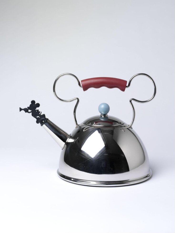
| Brief description | Kettle, stainless steel and plastic, designed by Michael Graves, made by Möller Design for the Walt Disney Company, Santa Ana, California, USA, 1991. |
| Physical description | Tea kettle of spun, polished stainless steel with coloured plastic details, the body a hemispherical dome resting on a flat circular base with a series of circular indentations and with a plain, moulded rim. The spout, into which is inserted a black plastic whistle in the form of a Mickey Mouse silhouette blowing a trumpet, is a tapered tube attached to the front of the body by a plain rim. The concave lid, following the radius of the body is secured by a flange and is surmounted by a slate blue, plastic ball knop. The handle, a looped piece of stainless steel wire is attached to the body on either side of the lid and is shaped to resemble the ears of Mickey Mouse; in the centre of which is a curved grip, indented on the underside in maroon coloured plastic. |
| Dimensions |
|
| Style | |
| Historical context | Michael Graves Michael Graves (1934-2015) was a leading American architect and designer, instrumental in the emergence of Post-Modernism in the mid-1970s. His classicising and colourful buildings are intended to make contemporary architecture more meaningful and accessible, referring to past tradition while also responding to contemporary surroundings. Born in Indianapolis, Indiana, on July 9, 1934, died, Princeton, New Jersey, March 12, 2015, Michael Graves studied architecture at the University of Cincinnati (B. Arch., 1958), at Harvard University (M. Arch., 1959), and, as winner of the Prix de Rome, at the American Academy in Rome (1960-1962). Beginning in 1962, he taught architecture at Princeton University and also maintained a private practice. From here his importance as both teacher and practicing architect steadily increased. Early in his career Graves was identified as a member of the New York Five, a group of young architects whose largely residential designs were reminiscent of the Swiss architect Le Corbusier in their geometric abstraction. A 1972 book on this group first brought Graves exposure and drew attention to the distinctive characteristics of his work. In his Hanselmann House (Fort Wayne, Indiana, 1967) a complexity of form and yet a transitory quality were created by his layering of exterior spaces. These qualities became more pronounced in his Benacerraf House addition (Princeton, New Jersey, 1969) and in his Snyderman House (Fort Wayne, 1972), as did his organization of interiors into distinct rooms, an approach at odds with the Modern movement's traditional emphasis on openness of plan. Graves also showed an interest in metaphor which would eventually separate him further from established Modernism. This metaphor was expressed variously in the classical sense of processional entry at the Hanselmann House or the colour coding of the Benacerraf addition, suggesting analogies with the natural environment. While still abstract, Graves' Snyderman House has surfaces that are eroded by porches, balconies, and open framing, liberally splashed with soft, bright colours that break emphatically with the whiteness of Modernism. The colour, collage-like murals, and almost Cubist spatial effects of his early projects reveal Graves' activity as a painter, as well as an architect. Modifying the Modern Tradition By the mid-1970s Michael Graves was moving vigorously away from the Modern tradition and toward an architecture he characterised as "figurative"—that is, related in visual and symbolic ways to human beings. Graves' architecture increasingly used anthropomorphic metaphors, such as the classical three-part division of a wall to suggest the feet, body, and head of a human figure. He distinguished between traditional elements such as wall and window, rejecting the Modern movement's blending of these into "window-wall." Graves began to mix pragmatic aspects of building with a more poetic sensitivity, seeking to re-humanise architecture so users could identify with and relate to it both physically and symbolically. In all of these ways, Graves was part of the emergence of a new style dubbed Post-Modernism. Although variously defined, Post-Modern architecture is, at its most basic, architecture that is rooted in the Modern movement, yet reacts against basic tenets established by such masters as Walter Gropius and Ludwig Mies van der Rohe. Graves' Post-Modernism is decidedly classicising. His architecture utilises forms and concepts that derive from the classical architectural tradition. To his love of the classical, however, Graves added his training in Modernist structure and his awareness of American traditions, developing a personal form of Post-Modern classicism. More three-dimensional and expressive, Graves' architecture of the mid-1970s included more direct symbolic references, alluding to tradition to re-establish meaning. His design for the Fargo-Moorhead Cultural Center Bridge (North Dakota-Minnesota, 1977) was denser, more massive than his earlier buildings, less brightly coloured, and more clearly related to particular sources, like the work of French architect Claude Ledoux. Graves' motifs (columns, pediments, arches, keystones) were fragmented, suggesting a classical past but never recalling any particular monument directly, as in the Plocek House (Warren, New Jersey, 1977). Post-Modernism Becomes Controversial Michael Graves' works after 1980 brought him international recognition as a leading figure in Post-Modernism, but not without engendering controversy. With other Post-Modernists, he was accused of extremism for radically departing from Modernism's pragmatic expression of function and materials. Graves, however, found Modernism alienating and created architecture intended to communicate with its surroundings and with the public by referring to architectural tradition. Especially important to him was ornament, rejected by Modernism but seen by Post-Modernists as essential to giving a building meaning. Despite this serious concern with meaning, Graves' Post-Modern buildings are colourful, paradoxical, even witty hybrids of references. A good example of all these qualities is his Portland (Oregon) Public Services Building (1980), the first substantial public project to use the Post-Modern style. The Portland Building also represents well the controversy surrounding Post-Modernism. Graves' competition-winning project was attacked by local architects of the Modernist camp. The uproar forced a second competition, but Graves' design won again, both for its style and its cost-effectiveness. Differentiated by form, colour, and material into three sections, his building suggests a classical organization of base, body, and crown. Graves' design was also highly contextual in complementing in style and scale the adjacent older city buildings and public park. Yet it is distinctive and celebratory; accented with stylised columns and a huge keystone, billowing garlands, and an allegorical statue, the building seeks to symbolize and inspire the city through multiple figurative references. Other buildings of the 1980s show that Michael Graves took on diverse large and small public and private projects from the Spanish mission style San Juan Capistrano (California) Public Library (1980) to the environmentally sympathetic Liberty State Park Environmental Education Center (Jersey City, New Jersey, 1980). In his 27-story Humana Medical Corporation Headquarters (Louisville, Kentucky, 1982), Graves' fragmented, metaphorical references continued, as did his use of colour to enliven surfaces, distinguish components, and relate building, nature, and people. Asserting its own personality, Graves' design was also contextual, healing the breach between small-scale downtown buildings and a tall glass-box skyscraper adjacent. Graves' first major building in New York City was the expansion of the Whitney Museum of American Art. His proposed design continued his vocabulary of distantly classical forms, blocky proportions, and varied colours and stirred up controversy. Resistance to Specialisation Beginning in the late 1970s, but particularly by the mid-1980s, Graves expanded his range of influence to the design of furniture (initiated when he was hired by Sunar Hauserman furniture to design a furniture showroom), rugs, kitchen products, dinnerware, jewelry, clocks, and watches. Quoted in the The Indianapolis Star in 1994, Graves said, "It's only in recent times that we've drawn the lines, that (we think) an architect only designs buildings." Graves' most famous small-scale creation was the chirping birdie teakettle produced by Alessi in 1985. He followed that with two different tea kettle designs for Moller International, one that featured the cartoon character, Mickey Mouse. It and a gourmet collection of housewares illustrated the many ties that developed between Graves and The Walt Disney Company. Graves also designed the company's corporate headquarters in Burbank, California, its Swan and Dolphin hotels at Walt Disney World in Orlando, Florida, Euro Disney's Hotel New York in Marne-La-Vallee, France, and a post office for Disney's planned Community of Celebration, Florida. A multifaceted and innovative artist and architect, Graves won numerous prizes and awards from such organisations as the American Institute of Architects and such professional journals as Progressive Architecture and Interiors. He also exhibited his drawings and designs nationwide. Further Reading A discussion of Graves' early work in relation to that of some of his contemporaries may be found in Five Architects: Eisenman, Graves, Gwathmey, Hejduk, Meier (1972 and 1975). The monograph Michael Graves, edited by David Dunster (1979), surveys Graves' work to that date and incorporates interpretive essays by Alan Colquhoun and Peter Carl. One overview of Graves' work is his own Michael Graves, Buildings and Projects 1966-1981 (1982), which begins with Graves' essay "A Case for Figurative Architecture," presents his work chronologically with numerous drawings and photographs, and includes an interpretive essay by Vincent Scully, "Michael Graves' Allusive Architecture." Two subsequent editions covering Graves' work from 1982-1989 and 1990-1994 have been published. Graves' relationship with Post-Modernism in general is considered in Charles Jencks' Post-Modern Classicism (1980) and The Language of Post-Modern Architecture (4th edition, 1984). |
| Summary | Michael Graves (b. 1934), one of the most diverse architectural and product designers in the USA has completed a wide variety of projects for public and private clients worldwide. His distinctive style blends perfectly for the Walt Disney Company for whom he has designed the Walt Disney World Dolphin and Swan Hotels in Orlando, Florida, the Disney Company Corporate Headquarters in Burbank, California and the Hotel New York at the Euro-Disney Resort. Graves is well known as an artist and the designer of furniture and decorative accessories. In addition to custom designs for corporate and residential projects, Graves' work includes collections of furniture, floor tiles, carpets and rugs, lighting fixtures, tableware and household objects. His landscapes, murals and prints are represented in numerous museums and private collections. The Mickey Mouse Gourmet Collection is his first consumer product for Disney. |
| Associated objects | |
| Bibliographic reference | ed. Glenn Adamson and Jane Pavitt, Postmodernism Style and Suversion, 1970-1990, London, Victoria and Albert Museum, 2011
p.82. pl.94 |
| Collection | |
| Accession number | M.29:1 to 3-2010 |
About this object record
Explore the Collections contains over a million catalogue records, and over half a million images. It is a working database that includes information compiled over the life of the museum. Some of our records may contain offensive and discriminatory language, or reflect outdated ideas, practice and analysis. We are committed to addressing these issues, and to review and update our records accordingly.
You can write to us to suggest improvements to the record.
Suggest feedback
You can write to us to suggest improvements to the record.
Suggest feedback
| Record created | November 15, 2010 |
| Record URL |
Download as: JSONIIIF Manifest


