
The Family Dog Presents The Steve Miller Blues Band
Poster
1967 (made)
1967 (made)
| Artist/Maker | |
| Place of origin |
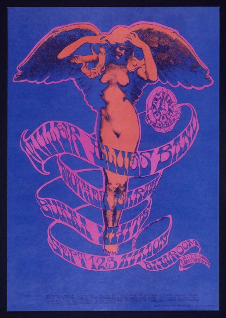
Stanley ‘Mouse’ Miller acquired his nickname from the mouse illustrations that he doodled all over his notebooks. After a spell at Detroit's School for the Society of Arts and Crafts (which he found uninspiring) Miller set up his own business, Mouse Studios, creating posters and T-shirts. Mouse moved to San Francisco in 1964, and meeting the artists associated with Family Dog, he began to design promotional posters for their events at the Avalon Ballroom with his friend Alton Kelley. The two worked closely together, with Mouse producing imagery around Kelley’s ideas, experimenting with visual styles, composition and lettering.
This poster combines extreme contrasting shades of saturated colour, florescent shades of orange and pink with strong violet-blue. Placing complementary colours, such as red and green or violet and orange, and even saturated shades of similar colours such as orange and pink, create a vibrating effect on the surface of the retina, disrupting the viewer’s ability to comprehend elements of the poster. Here, the use of colour makes the lettering difficult to decipher, meaning that the viewer would need to spend more time examining the poster to perceive the message. As previously discussed, this idea of a ‘slow poster’ flies in the face of accepted design practice, (where the message was intended to be transparent) but was designed to appeal to a specific element of contemporary west-coast youth culture.
This poster combines extreme contrasting shades of saturated colour, florescent shades of orange and pink with strong violet-blue. Placing complementary colours, such as red and green or violet and orange, and even saturated shades of similar colours such as orange and pink, create a vibrating effect on the surface of the retina, disrupting the viewer’s ability to comprehend elements of the poster. Here, the use of colour makes the lettering difficult to decipher, meaning that the viewer would need to spend more time examining the poster to perceive the message. As previously discussed, this idea of a ‘slow poster’ flies in the face of accepted design practice, (where the message was intended to be transparent) but was designed to appeal to a specific element of contemporary west-coast youth culture.
Object details
| Categories | |
| Object type | |
| Title | The Family Dog Presents The Steve Miller Blues Band (generic title) |
| Materials and techniques | Colour offset lithograph |
| Brief description | "Miller Blues Band" psychedelic poster No 78-1 by Mouse Studios (Stanley "Mouse" Miller and Alton Kelley). Family Dog Productions. USA, 1967. |
| Physical description | Psychedelic poster advertising a concert at the Avalon Ballroom featuring the Steve Miller band. The poster is printed in orange and pink shades of red on a strong blue background, and depicts a nude and winged female figure around which is draped banners with the names of the performers and venue details. The text, which id printed in pink-red on blue, reads, 'Family Dog Presents Miller Blues Band, Mother Earth, Bukka White, September 1-2-3 Avalon Ballroom'. |
| Dimensions |
|
| Marks and inscriptions |
|
| Credit line | Gift of the American Friends of the V&A; Gift to the American Friends by Leslie, Judith and Gabri Schreyer and Alice Schreyer Batko |
| Subjects depicted | |
| Summary | Stanley ‘Mouse’ Miller acquired his nickname from the mouse illustrations that he doodled all over his notebooks. After a spell at Detroit's School for the Society of Arts and Crafts (which he found uninspiring) Miller set up his own business, Mouse Studios, creating posters and T-shirts. Mouse moved to San Francisco in 1964, and meeting the artists associated with Family Dog, he began to design promotional posters for their events at the Avalon Ballroom with his friend Alton Kelley. The two worked closely together, with Mouse producing imagery around Kelley’s ideas, experimenting with visual styles, composition and lettering. This poster combines extreme contrasting shades of saturated colour, florescent shades of orange and pink with strong violet-blue. Placing complementary colours, such as red and green or violet and orange, and even saturated shades of similar colours such as orange and pink, create a vibrating effect on the surface of the retina, disrupting the viewer’s ability to comprehend elements of the poster. Here, the use of colour makes the lettering difficult to decipher, meaning that the viewer would need to spend more time examining the poster to perceive the message. As previously discussed, this idea of a ‘slow poster’ flies in the face of accepted design practice, (where the message was intended to be transparent) but was designed to appeal to a specific element of contemporary west-coast youth culture. |
| Bibliographic reference | Christoph Grunberg, ed. Summer of Love: Art of the Psychedelic Era London: Tate, 2005. 239 p. : ill. (some col.) ISBN: 1854375954. |
| Other numbers |
|
| Collection | |
| Accession number | E.414-2004 |
About this object record
Explore the Collections contains over a million catalogue records, and over half a million images. It is a working database that includes information compiled over the life of the museum. Some of our records may contain offensive and discriminatory language, or reflect outdated ideas, practice and analysis. We are committed to addressing these issues, and to review and update our records accordingly.
You can write to us to suggest improvements to the record.
Suggest feedback
You can write to us to suggest improvements to the record.
Suggest feedback
| Record created | January 27, 2005 |
| Record URL |
Download as: JSON
