
Literature Guidelines
Print
1990 (made)
1990 (made)
| Artist/Maker | |
| Place of origin |
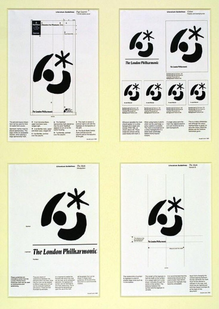
In 1990 Rufus Leonard Design Consultants designed a new corporate identity for the London Philharmonic Orchestra. Their brief was to produce a ‘mark’, a combination of symbol and lettering, for use on all the orchestra’s communication material. This sheet is the introductory page from a booklet given to the client at the end of the project. The booklet included layout guidelines and details of recommended ink colours, papers and typefaces. This was to ensure that certain standards could be maintained after the design had been handed over to the client.
Object details
| Category | |
| Object type | |
| Title | Literature Guidelines (assigned by artist) |
| Materials and techniques | Print on paper |
| Brief description | Printed sheet with illustration and written guidelines for the layout of communication material, designed for the London Philharmonic Orchestra by Rufus Leonard Design Consultants, 1990 |
| Physical description | Sheet of white paper with a symbol, logotype, labels and text printed in black ink. |
| Dimensions |
|
| Marks and inscriptions |
|
| Credit line | Given by the artist |
| Subjects depicted | |
| Summary | In 1990 Rufus Leonard Design Consultants designed a new corporate identity for the London Philharmonic Orchestra. Their brief was to produce a ‘mark’, a combination of symbol and lettering, for use on all the orchestra’s communication material. This sheet is the introductory page from a booklet given to the client at the end of the project. The booklet included layout guidelines and details of recommended ink colours, papers and typefaces. This was to ensure that certain standards could be maintained after the design had been handed over to the client. |
| Associated objects | |
| Collection | |
| Accession number | E.2139:11-1991 |
About this object record
Explore the Collections contains over a million catalogue records, and over half a million images. It is a working database that includes information compiled over the life of the museum. Some of our records may contain offensive and discriminatory language, or reflect outdated ideas, practice and analysis. We are committed to addressing these issues, and to review and update our records accordingly.
You can write to us to suggest improvements to the record.
Suggest feedback
You can write to us to suggest improvements to the record.
Suggest feedback
| Record created | February 7, 2004 |
| Record URL |
Download as: JSON
