
Notes from the London Philharmonic
Leaflet
1990 (made)
1990 (made)
| Artist/Maker | |
| Place of origin |
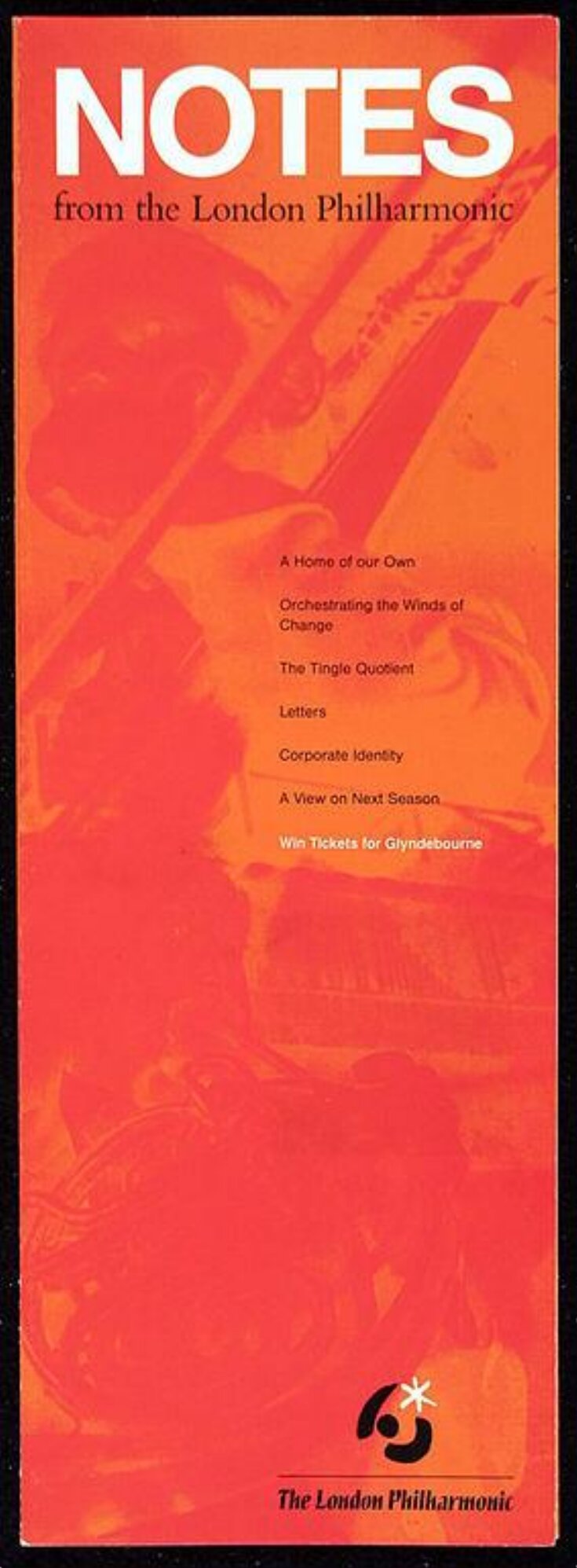
This is a leaflet published in 1990 by the London Philharmonic Orchestra. The orchestra had recently commissioned a new corporate identity from Rufus Leonard Design Consultants. The brief was to design a ‘mark’, a combination of a ‘symbol’ and ‘logotype’ (an image and a caption), to be printed on all the orchestra’s communication material. This leaflet shows the chosen mark, based on a conductor with batons, or music dancing between outstretched arms. The orchestra has since simplified its mark to a single blue star, suggesting that, when they update their identity, organisations can benefit from retaining something of their existing mark in order to be recognised.
Object details
| Categories | |
| Object type | |
| Title | Notes from the London Philharmonic (assigned by artist) |
| Materials and techniques | Printed paper |
| Brief description | Leaflet entitled 'Notes from the London Philharmonic' with mark designed by Rufus Leonard Design Consultants, 1990 |
| Physical description | A single sheet concertina-folded eight times to form a leaflet, printed with textual information and images relating to the London Philharmonic Orchestra. |
| Dimensions |
|
| Marks and inscriptions |
|
| Credit line | Given by the consultants |
| Subjects depicted | |
| Place depicted | |
| Summary | This is a leaflet published in 1990 by the London Philharmonic Orchestra. The orchestra had recently commissioned a new corporate identity from Rufus Leonard Design Consultants. The brief was to design a ‘mark’, a combination of a ‘symbol’ and ‘logotype’ (an image and a caption), to be printed on all the orchestra’s communication material. This leaflet shows the chosen mark, based on a conductor with batons, or music dancing between outstretched arms. The orchestra has since simplified its mark to a single blue star, suggesting that, when they update their identity, organisations can benefit from retaining something of their existing mark in order to be recognised. |
| Associated objects | |
| Collection | |
| Accession number | E.2143-1991 |
About this object record
Explore the Collections contains over a million catalogue records, and over half a million images. It is a working database that includes information compiled over the life of the museum. Some of our records may contain offensive and discriminatory language, or reflect outdated ideas, practice and analysis. We are committed to addressing these issues, and to review and update our records accordingly.
You can write to us to suggest improvements to the record.
Suggest feedback
You can write to us to suggest improvements to the record.
Suggest feedback
| Record created | January 28, 2004 |
| Record URL |
Download as: JSON
