
Alphabet
Print
ca. 1954 (printed)
ca. 1954 (printed)
| Artist/Maker |
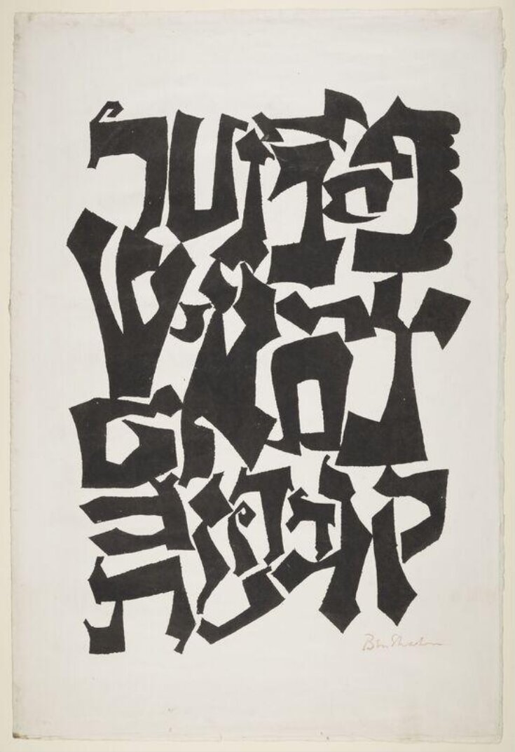
The Jewish artist Ben Shahn (1898-1969) was born in Lithuania and went to the USA as a child. At fourteen he was apprenticed to a lithographer's shop, where his training included endless drawing of the alphabet until the forms were good enough to be printed. The discipline and craft learned then stayed with him. This design is based on the letters of the Hebrew alphabet - a similar design was used for the cover of his book The Alphabet of Creation, after a 13th-century text that celebrates the divine origin and mystic value of letters. The balance of black and white recalls his workshop training, which stressed the importance of space around the letters as well as the shapes themselves. Serigraphy is different from screenprint in that rather than using a stencil on the screen the artist paints directly and un-'guided' onto the screen.
Object details
| Categories | |
| Object type | |
| Title | Alphabet (assigned by artist) |
| Materials and techniques | Screen print on paper |
| Brief description | Ben Shahn: 'Alphabet'. Screenprint with a design formed from letters of the Hebrew alphabet. Ca.1954. |
| Physical description | Print in black on paper. Abstract image formed with letters of the Hebrew Alphabet. |
| Dimensions |
|
| Styles | |
| Production type | Limited edition |
| Marks and inscriptions | 'Ben Shahn' (Signed in ink) |
| Credit line | Given by Mr S. S. Spivak |
| Object history | This design embodies the letters of the Hebrew alphabet. The drawing on which it is based is in the Sachs Collection of the Fogg Art Museum, Harvard University, and is reproduced on p.80 of Ben Shahn His graphic art by J. T. Soby, New York, 1957. A similar design was used on the front cover of the artist’s The Alphabet of Creation, New York, 1954, and for the cover of Print, Vol IX, No.3, October-November, 1954. |
| Summary | The Jewish artist Ben Shahn (1898-1969) was born in Lithuania and went to the USA as a child. At fourteen he was apprenticed to a lithographer's shop, where his training included endless drawing of the alphabet until the forms were good enough to be printed. The discipline and craft learned then stayed with him. This design is based on the letters of the Hebrew alphabet - a similar design was used for the cover of his book The Alphabet of Creation, after a 13th-century text that celebrates the divine origin and mystic value of letters. The balance of black and white recalls his workshop training, which stressed the importance of space around the letters as well as the shapes themselves. Serigraphy is different from screenprint in that rather than using a stencil on the screen the artist paints directly and un-'guided' onto the screen. |
| Bibliographic reference | Victoria and Albert Museum Department of Prints and Drawings and Department of Paintings, Accessions 1959 . London: HMSO, 1964. |
| Collection | |
| Accession number | E.5-1959 |
About this object record
Explore the Collections contains over a million catalogue records, and over half a million images. It is a working database that includes information compiled over the life of the museum. Some of our records may contain offensive and discriminatory language, or reflect outdated ideas, practice and analysis. We are committed to addressing these issues, and to review and update our records accordingly.
You can write to us to suggest improvements to the record.
Suggest feedback
You can write to us to suggest improvements to the record.
Suggest feedback
| Record created | December 16, 2002 |
| Record URL |
Download as: JSON
