
Ausstellung deutsche Gebrauchsgraphik
Poster
ca. 1955 (printed)
ca. 1955 (printed)
| Artist/Maker | |
| Place of origin |
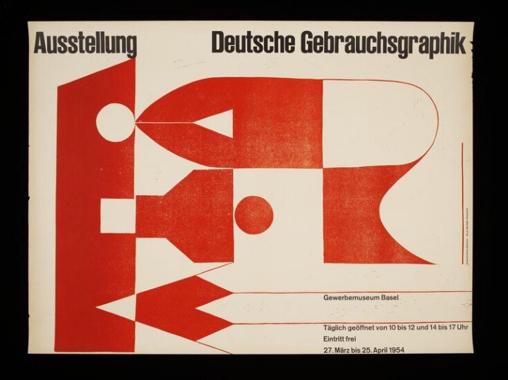
The graphic designer Armin Hofmann (born 1920 ) was a leading proponent of the International Typographic Style which emerged in Switzerland in the 1950s and went on to have a global impact on graphic design. It was a style characterised by a strong reliance on typographic elements and the use of sans serif typeface. In his posters, Hofmann uses restricted colours and forms and approaches typography as an integral part of the overall design expression - not just a means of transmitting literal information. Hofmann became well known for his work for cultural institutions in Basel and his style became synonymous with the institutions it was used to promote.
Object details
| Categories | |
| Object type | |
| Title | Ausstellung deutsche Gebrauchsgraphik (generic title) |
| Materials and techniques | Linocut on paper |
| Brief description | Poster advertising the exhibition 'Ausstellung deutsche Gebrauchsgraphik' by Armin Hofmann, Switzerland, ca. 1955 |
| Physical description | Poster advertising a graphic design exhibition. Red linocut design on white paper showing a stylised representation of fountain pen nib, a bottle of ink and a pencil tip. |
| Dimensions |
|
| Gallery label | Hofmann was leading designer in the International Typographic Style which emerged in Switzerland in the 1950s and had a global impact on graphic design. He limited his use of colour, and integrated the typography as a design feature, not simply a means of transmitting information. This poster for a graphic design exhibition shows stylised pens and pencils.(11/09/2017) |
| Credit line | Purchased through the Julie and Robert Breckman Print Fund |
| Subjects depicted | |
| Summary | The graphic designer Armin Hofmann (born 1920 ) was a leading proponent of the International Typographic Style which emerged in Switzerland in the 1950s and went on to have a global impact on graphic design. It was a style characterised by a strong reliance on typographic elements and the use of sans serif typeface. In his posters, Hofmann uses restricted colours and forms and approaches typography as an integral part of the overall design expression - not just a means of transmitting literal information. Hofmann became well known for his work for cultural institutions in Basel and his style became synonymous with the institutions it was used to promote. |
| Collection | |
| Accession number | E.5-2006 |
About this object record
Explore the Collections contains over a million catalogue records, and over half a million images. It is a working database that includes information compiled over the life of the museum. Some of our records may contain offensive and discriminatory language, or reflect outdated ideas, practice and analysis. We are committed to addressing these issues, and to review and update our records accordingly.
You can write to us to suggest improvements to the record.
Suggest feedback
You can write to us to suggest improvements to the record.
Suggest feedback
| Record created | February 9, 2006 |
| Record URL |
Download as: JSON
