Lectern Bible
2005 (made)
| Artist/Maker | |
| Place of origin |
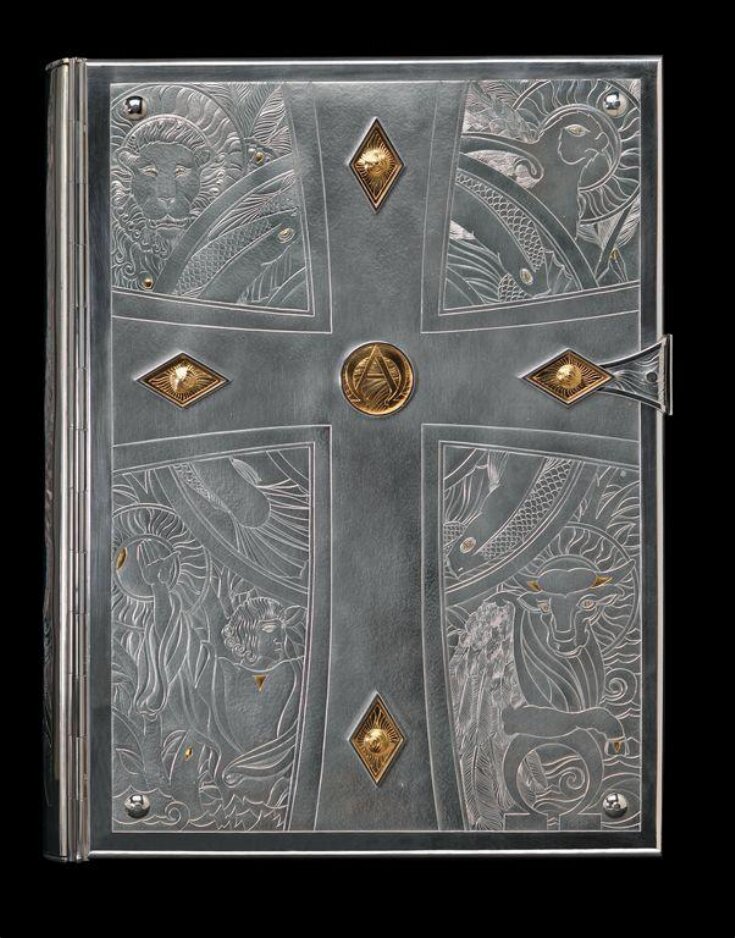
The V&A commissioned these silver bible covers to celebrate the opening of the Sacred Silver and Stained Glass gallery in 2005. Rod Kelly, who designed and made them, is known for his chased decoration. In this technique the silversmith models the design on the surface without actually removing any metal.
Here the front cover represents the New Testament. It shows the symbols of the Evangelists who wrote the Gospels that make up the first four books of the New Testament. St Matthew’s symbol is the winged angel or man. The lion represents St Mark. St Luke’s symbol is the winged ox and St John’s is the eagle. The back cover shows a crown of thorns (to recall that placed on Christ’s head before the Crucifixion), surrounded by images taken from the Old Testament.
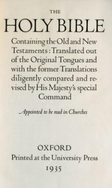
The covers were commissioned to cover a bible designed by the eminent typographer Bruce Rogers for the Oxford University Press in 1935. The bookbinder James Brockman came up with an innovative solution to the challenge of uniting the two large volumes into a single binding. The principal issue lay with the spine of the book. This flexes every time the book is opened, eventually causing the sewing to break. To prevent this, Brockman developed a rigid concave spine in the 1980s and used it here to prevent the size and weight of the metal covers damaging the book as it was opened. If a metal binding has a conventional convex or flat spine, the pages will not open well as the hinges need to move apart when the book is opened. If a rigid concave spine is used, as here, the hinges do not need to move apart as the spine is held permanently in the open position. The double hinges on each cover were incorporated to allow the covers to open over 180 degrees.
Here the front cover represents the New Testament. It shows the symbols of the Evangelists who wrote the Gospels that make up the first four books of the New Testament. St Matthew’s symbol is the winged angel or man. The lion represents St Mark. St Luke’s symbol is the winged ox and St John’s is the eagle. The back cover shows a crown of thorns (to recall that placed on Christ’s head before the Crucifixion), surrounded by images taken from the Old Testament.
The covers were commissioned to cover a bible designed by the eminent typographer Bruce Rogers for the Oxford University Press in 1935. The bookbinder James Brockman came up with an innovative solution to the challenge of uniting the two large volumes into a single binding. The principal issue lay with the spine of the book. This flexes every time the book is opened, eventually causing the sewing to break. To prevent this, Brockman developed a rigid concave spine in the 1980s and used it here to prevent the size and weight of the metal covers damaging the book as it was opened. If a metal binding has a conventional convex or flat spine, the pages will not open well as the hinges need to move apart when the book is opened. If a rigid concave spine is used, as here, the hinges do not need to move apart as the spine is held permanently in the open position. The double hinges on each cover were incorporated to allow the covers to open over 180 degrees.
Object details
| Categories | |
| Object type | |
| Materials and techniques | Silver, chased and engraved, inlaid with 24 carat gold |
| Brief description | Cover, silver and 24 carat gold, London hallmarks for 2005, designed and made by Rod Kelly; the book bound with a rigid concave spine by James and Stuart Brockman. |
| Physical description | Lectern Bible, originally in two folio volumes in maroon fabric covered boards, 1216 pages, continuous pagination, one of 200 copies printed on Batchelor's hand made paper in modified Centaur type, the leaves with gilded edges, Oxford University Press, 1935. The typography designed by the noted American typographer, Bruce Rogers and this Bible is therefore known as the Bruce Rogers Bible. The boards have been removed, some minor conservation work and the two folios combined into one volume by the bookbinder, James Brockman. The silver covers with gold details designed and executed by Rod Kelly with some assistance in the making by Ian Calvert. The front and back covers are two rectangular sheets of silver with extensive, chased decoration and 24 carat gold details. The front panel illustrates symbols representing the New Testament while the back, the Old Testament. Each panel is chased with a large cross set against a circular frame; the front chased with fishes, the back chased with a crown of thorns. In the each corner of the front panel are chased symbols of the four evagelists, the top left hand corner is a lion for St. Mark and reading clockwise, in the upper right, the eagle for St. John, the lower right, the bull for St Luke and in the lower left, a youth symbolising St. Matthew. The back panel has in each corner, symbols of The Creation, the upper two corners depict the sea, the lower left hand corner illustrates the tree of life and the apple, while the lower right hand corner represents the Commandments by an engraved tablet with Roman numerals, a shell and sheaf of wheat. In the centre of each cross on both front and back panels is a circular, chased medallion containing the letters representing Alpha and Omega. At each extremity of each cross is a raised diamond shaped lozenge which chased decoration. Both the circular medallions and the diamond shaped lozenges are overlaid with 24 carat gold. The medallions, lozenges, and four bosses in each corner of the front and back covers serve to conceal the screws which secure the external covers to the inner plates attached to the binding. The binding has a rigid concave spine with double hinges on the covers. The spine is a curved, oblong sheet of silver with chasing which images of water, quails, wine and wheat which represent the Four Provisions. The three sections, front, back and spine panels are held together by two continuous hinges. The clasp holding the binding shut and in the centre of the leading edge is in the form of a Greek cross, held together by a silver rod with domed finials. When removed the cross divides into two halves. |
| Dimensions |
|
| Marks and inscriptions |
|
| Gallery label | Bible
To celebrate the opening of the Sacred Silver and Stained Glass gallery in 2005, the V&A commissioned Rod Kelly to design covers for a church Bible.
Kelly is known for his chasing, in which the design is worked up in relief. Here the front cover represents the New Testament and shows the symbols of the four Evangelists - Matthew, Mark, Luke and John - who wrote the Gospels. The back shows a crown of thorns (to recall that placed on Christ's head before the Crucifixion), surrounded by images taken from the Old Testament.
London, England, 2005; by Rod Kelly (born 1956)
The Bible designed by Bruce Rogers for
the Clarendon Press, Oxford, 1935
Silver inlaid with gold
Gift of the Whiteley family
Museum no. M.21-2005(27/10/2005) |
| Credit line | Gift of the A.H & B.C. Whiteley Trust |
| Historical context | The Modern Church In the late Victorian period two architects turned- craftsmen, Henry Wilson and C.R. Ashbee, initiated a decisive shift towards fine craftsmanship in church silver. This led to a sharp fall in the standing of commercial manufacturers but provided a steady source of work for many designer-silversmiths that has lasted into the present day. This revival of craftsmanship came out of the Arts and Crafts movement, one of the greatest social and artistic forces of the age. Favouring small studio workshops and simplicity of form, the movement set the pattern for church silver throughout the 20th century, whether for major cathedral commissions or for parish churches. |
| Subjects depicted | |
| Summary | The V&A commissioned these silver bible covers to celebrate the opening of the Sacred Silver and Stained Glass gallery in 2005. Rod Kelly, who designed and made them, is known for his chased decoration. In this technique the silversmith models the design on the surface without actually removing any metal. Here the front cover represents the New Testament. It shows the symbols of the Evangelists who wrote the Gospels that make up the first four books of the New Testament. St Matthew’s symbol is the winged angel or man. The lion represents St Mark. St Luke’s symbol is the winged ox and St John’s is the eagle. The back cover shows a crown of thorns (to recall that placed on Christ’s head before the Crucifixion), surrounded by images taken from the Old Testament. The covers were commissioned to cover a bible designed by the eminent typographer Bruce Rogers for the Oxford University Press in 1935. The bookbinder James Brockman came up with an innovative solution to the challenge of uniting the two large volumes into a single binding. The principal issue lay with the spine of the book. This flexes every time the book is opened, eventually causing the sewing to break. To prevent this, Brockman developed a rigid concave spine in the 1980s and used it here to prevent the size and weight of the metal covers damaging the book as it was opened. If a metal binding has a conventional convex or flat spine, the pages will not open well as the hinges need to move apart when the book is opened. If a rigid concave spine is used, as here, the hinges do not need to move apart as the spine is held permanently in the open position. The double hinges on each cover were incorporated to allow the covers to open over 180 degrees. |
| Collection | |
| Accession number | M.21-2005 |
About this object record
Explore the Collections contains over a million catalogue records, and over half a million images. It is a working database that includes information compiled over the life of the museum. Some of our records may contain offensive and discriminatory language, or reflect outdated ideas, practice and analysis. We are committed to addressing these issues, and to review and update our records accordingly.
You can write to us to suggest improvements to the record.
Suggest feedback
You can write to us to suggest improvements to the record.
Suggest feedback
| Record created | October 27, 2005 |
| Record URL |
Download as: JSON
